Blazars are known to show complex multiwavelength variability which is specifically difficult to decipher when focusing on a single event without good broadband coverage. In order to have a broader view on a specific blazar's behavior, we performed the most extended multiwavelength study ever done on the bright source 1ES 1215+303 (B2 1215+30), from radio to TeV energies, over a decade of observations in gamma-ray energies and extended to 15 years for optical and radio data. After a detailed analysis of the lightcurve and spectra in multiple bands, two big surprises awaited us.
The first one is the discovery of a steady flux increase significantly observed in the gamma-ray (Fermi-LAT) and optical lightcurves, which started around August 2011 and continued at least up to 2017. This timescale of variability is not well understood. It is too long for a phenomenon intrinsic to the relativistic blazar jet which can span from several minutes (for a small population of ultra-energetic particles) to months (when considering large scale perturbations or large plasma bulk motion), and is typically >>100 years when considering the natural evolution of a supermassive black hole's general accretion disk regime. If other scenarios are considered, this flux increase seems consistent with a perturbation (a clump of matter) within the accretion disk falling into the black hole while driving more power to the jet.
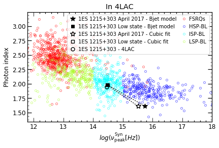
The second surprise is an extreme shift of the synchrotron luminosity peak frequency from the optical in quiet state to the X-ray in flaring state. It means that the source can actually "jump" from one category of blazar (intermediate frequency peaked BL Lac, IBL) to another (high frequency peaked BL Lac, HBL). This exceptional behaviour was already suspected in a few sources, but this is the first time that we see it this clearly and at this amplitude. The multiwavelength modelling of this phenomenon suggests a deep change of high energy particle injection and adiabatic/advective cooling between the two states. It brings however more questions than answers about the origin of the mechanism, while also challenging our current understanding of the blazar classification scheme.
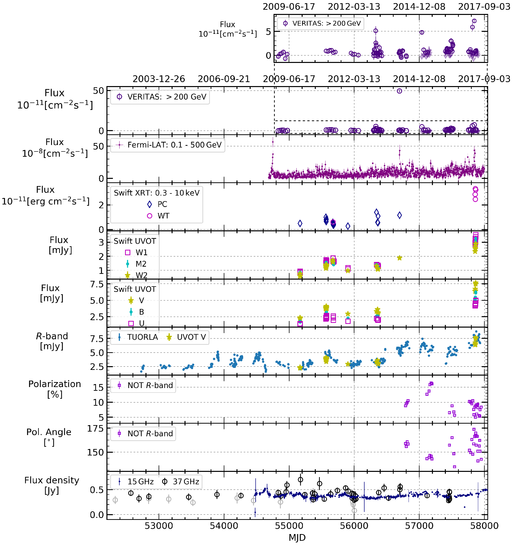
Figure 1: The light curves for the various wave bands are shown in descending order of energy from the top to the bottom of the plot. A zoom is provided on the VERITAS data excluding Flare 3. For the XRT panel, the data taken in window-timing (WT) and photon-counting (PC) mode are plotted. For the radio panel, the 37 GHz data with signal to noise ratio S/N< 4 are shown in gray..
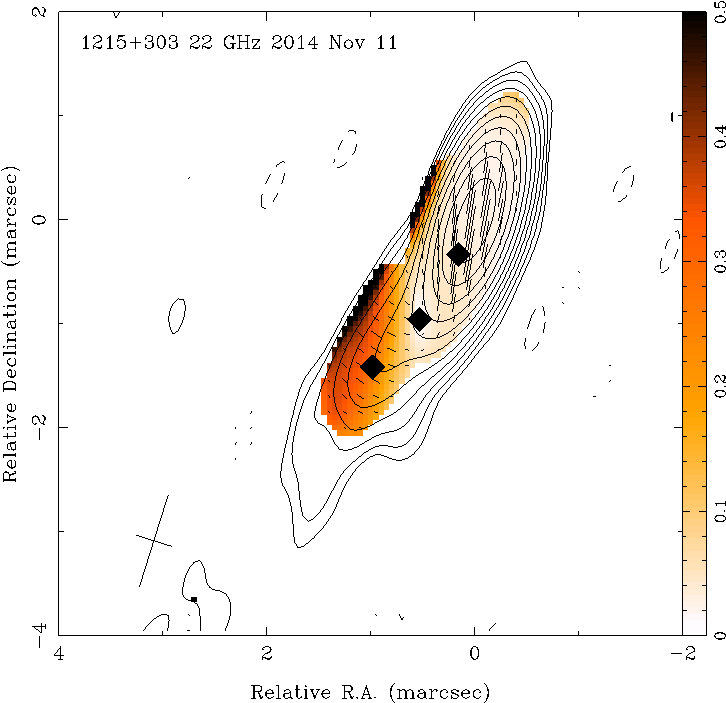
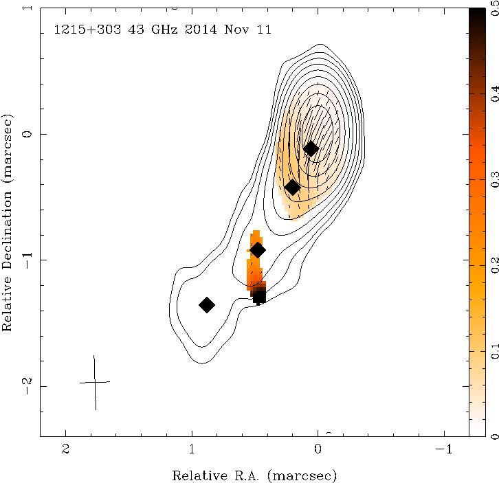
Figure 2: Left: VLBA image at 22.2 GHz. Contours show total intensity, with the lowest contour at 0.129 mJy beam-1, and subsequent contours factors of two higher. The peak flux density is 229 mJy beam-1. The naturally-weighted beam size is 0.914 by 0.358 mas at a position angle of the major axis of -17.4o . Sticks show the magnitude of the linearly-polarized flux density (with a scale of 0.1 mas mJy-1) and the direction of the EVPA. The color scale indicates fractional polarization. Right: VLBA image at 43.1 GHz. The lowest contour is 0.308 mJy beam-1; the peak flux density is 152 mJy beam-1. The naturally-weighted beam size is 0.432 by 0.241 mas at 1.9o. The polarized flux density scale of the sticks is 0.05 mas mJy-1. The centers of the Gaussian jet components are shown as fi lled diamonds. The beams are shown in the bottom left-hand corner of each panel as a plus "+".
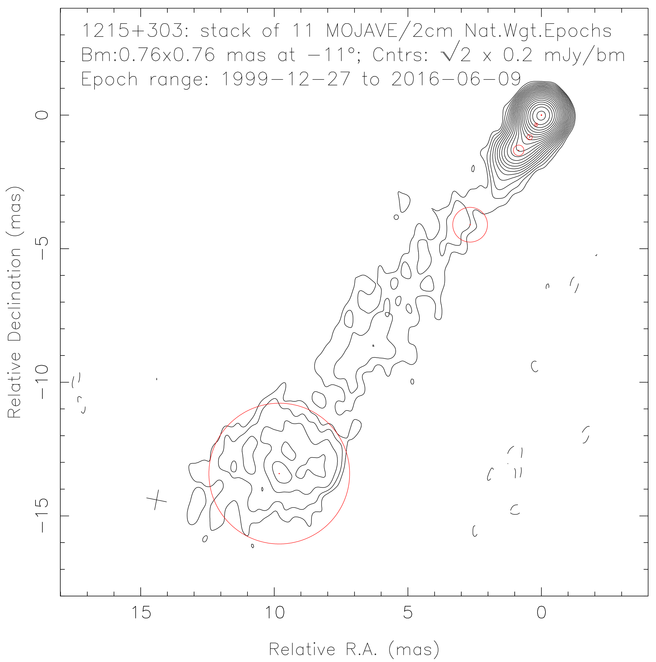
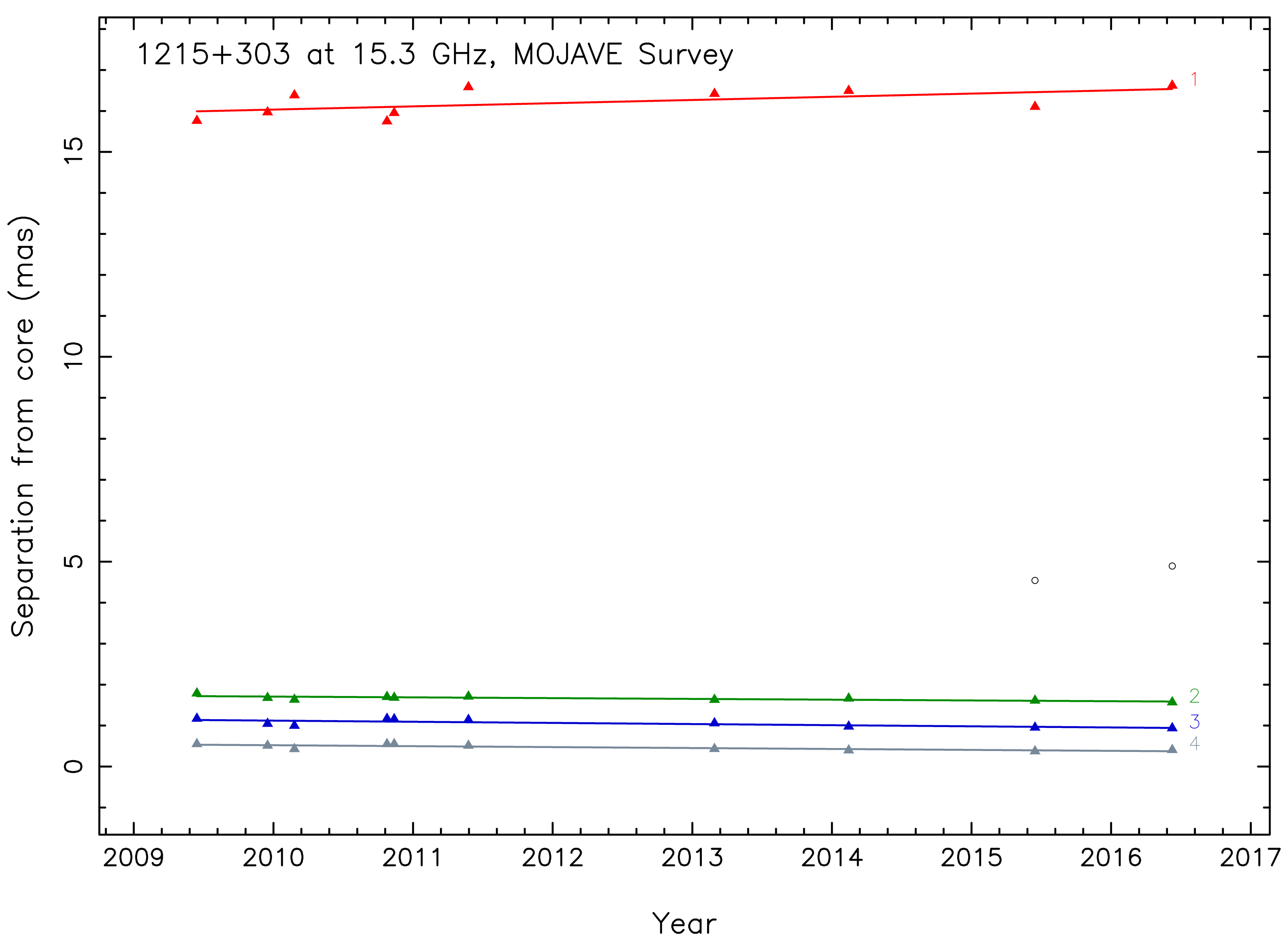
Figure 3: Left: The stacked MOJAVE image with the five best- fit Gaussian components from the last epoch on 2016 June 9 overlaid. The standard deviations of the best-fi t Gaussian components are approximately 20% of the FWHM beam dimensions. The contours show the total intensity, starting at a baseline of 0.2 mJy beam-1, and incrementing by factors of √2. Eleven images are stacked here including one from 27 December 1999 which is not shown on the plot on the right. The same circular restoring beam was used for all eleven images. It is shown at the half power level in the bottom left corner as a plus "+". Right: The separation between components and the core at the time of each epoch of observation. The innermost three components (designated with number 2, 3, and 4) are quasi-stationary. Robust features which are cross-identifi ed between more than 4 epochs are fi tted assuming linear motion.
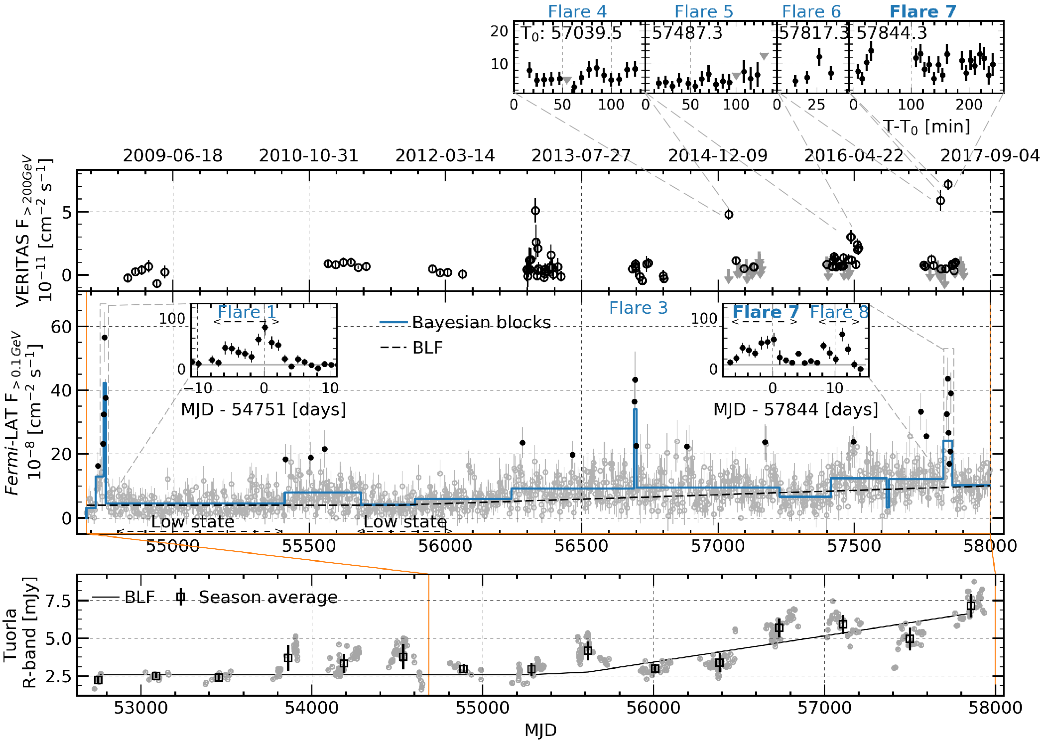
Figure 4: The GeV-TeV full gamma-ray dataset. Top: The VERITAS light curve (above 200 GeV and excluding Flare 3), with detailed zoom in the VHE flares down to the sub-hour timescales, from year 2015. T0 is in MJD. Upper limits in gray. Middle: Fermi-LAT 3-day light curve with daily zoom in the Flares 1, 7 and 8 (see text for details). Data points deviating ≥3σ from the broken linear function (BLF, dashed line) are shown in black. From these, only the points with two neighbors were used to de fine the four LAT flares. Bayesian blocks are shown in blue. These were used to defi ne the low state of this source. Bottom: Tuorla light curve in gray with seasonal average in black. The last nine years are contemporaneous to the time range in the upper panels.
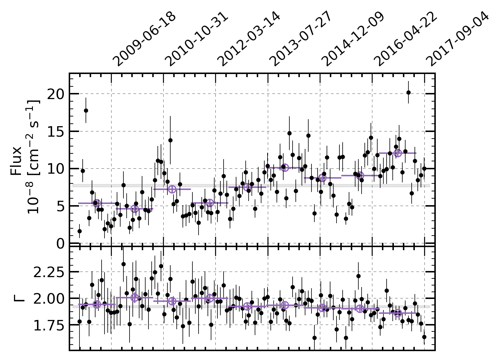
Figure 5: Top: The 30-day binned (black points) and 360-day binned light curves (violet points). Bottom: Monthly spectral shape for the 30-day binned (black) and 360-day binned (violet) data. The gray shading in each of the two panels represent the value obtained for the entire 9-year data set.
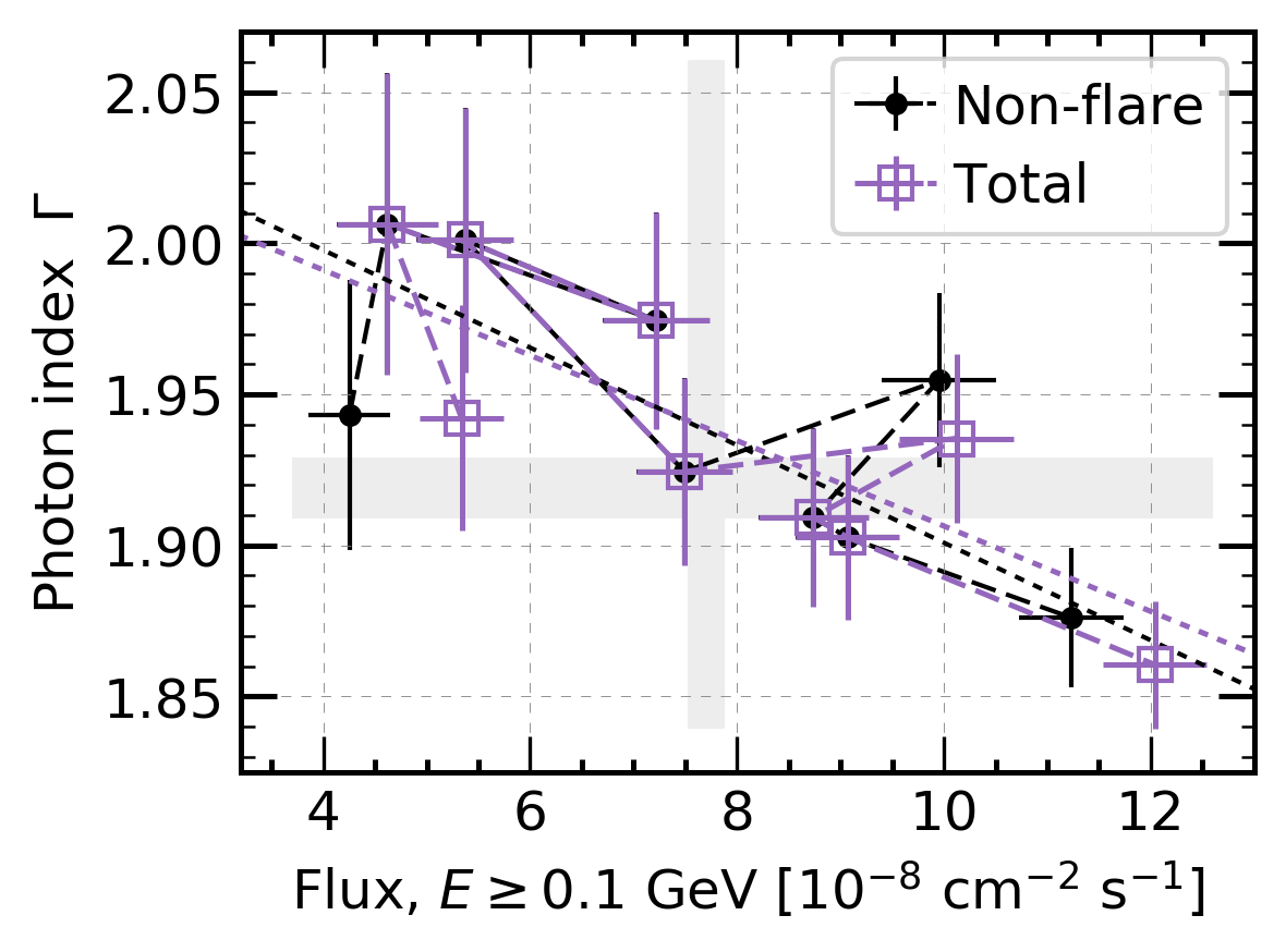
Figure 6: Power-law photon index, Γ, against flux for the 360-day binned Fermi-LAT data. The violet square points show the average value per bin, while black points show the non- flaring state values. Dotted lines show the results of the linear fits. The 360-day light curve and photon indices against time are shown in Figure 5 for the total data, in violet as well. The dashed lines join the data chronologically, going approximately from left to right, from where the long-term brightening and hardening can be visualised.
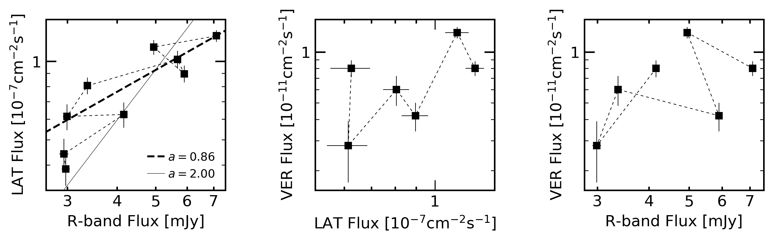
Figure 7: Seasonal flux-flux diagrams for VERITAS, the Fermi-LAT and Tuorla (R-band) energy ranges (in logarithmic scale). The data is labeled from Season 1 (S1), in 2009, to Season 9 (S9), in 2017. The dotted lines join the data chronologically, going approximately from left to right due to the long-term brightening observed in the GeV and optical light curves. The dashed line represents the fit to the expression log10(FLAT) = a log10(Fopt) - b. The solid line is the fi t to the same expression with a = 2.
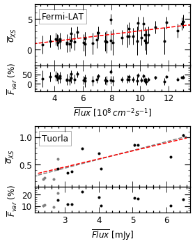
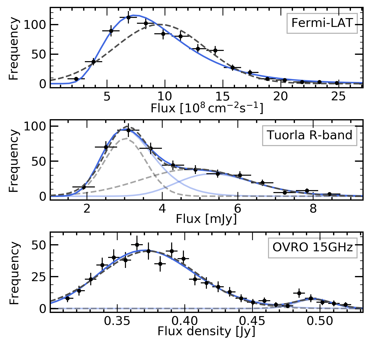
Figure 8: Left: The excess variance ( σXS) and variability amplitude (Fvar) for the Fermi-LAT and Tuorla data. Right: LAT, Tuorla and OVRO flux distributions. The (bi)log-normal best fit is shown in solid light blue lines and the (bi)normal in dashed gray lines. The components of the bi-functions are shown in lighter blue for the bi-log-normal and in lighter gray for the normal function.
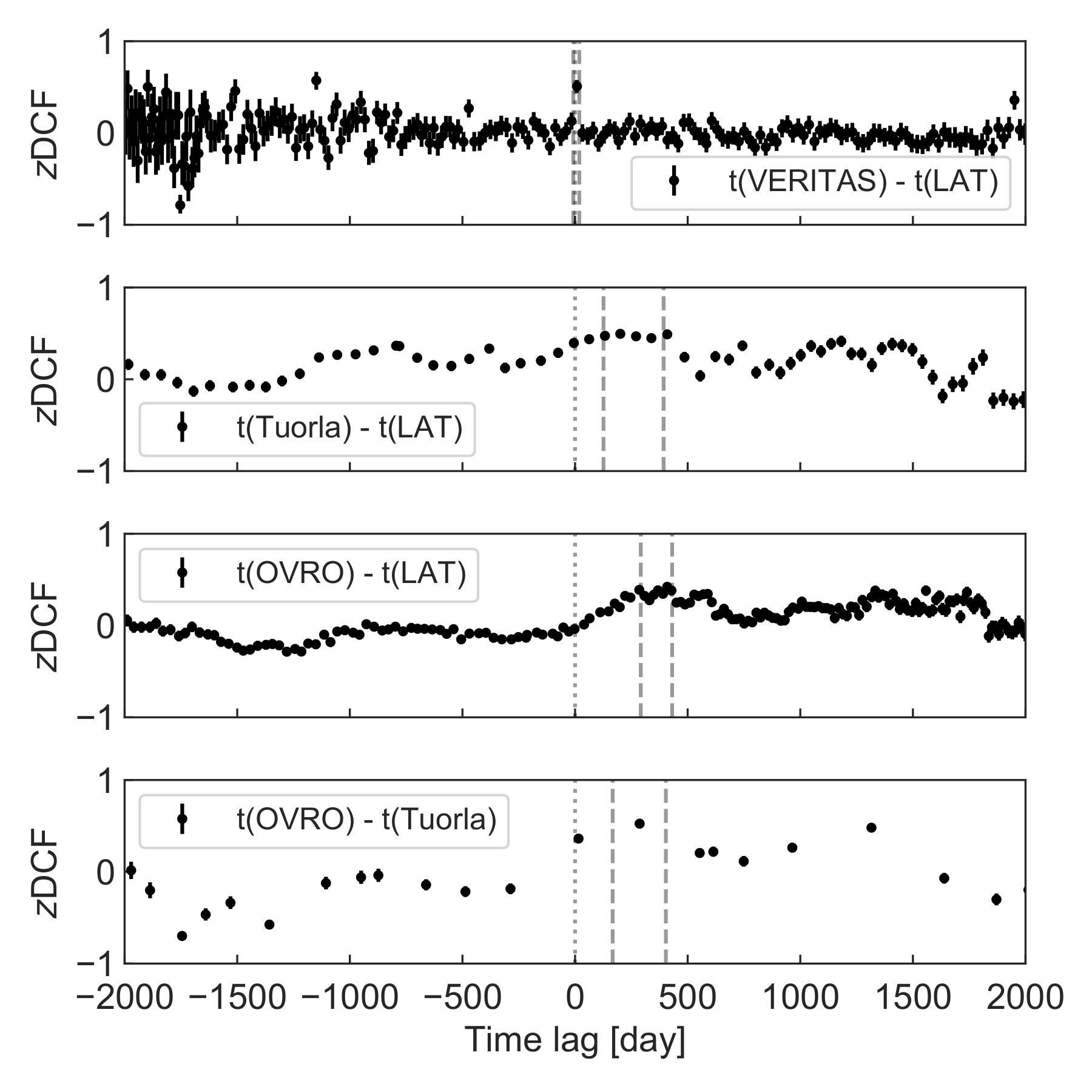
Figure 9: The ZDCFs between light curves measured at diff erent wavelengths. The pair of wavelengths in each panel is shown in the legend. A positive time lag (t(X) - t(Y ) > 0) between band X and band Y means the emission in band X lags behind that in band Y . The vertical dotted lines show the time lag of zero, and the vertical dashed lines show the 1σ confi dence interval around the maximum-likelihood peak time lag.
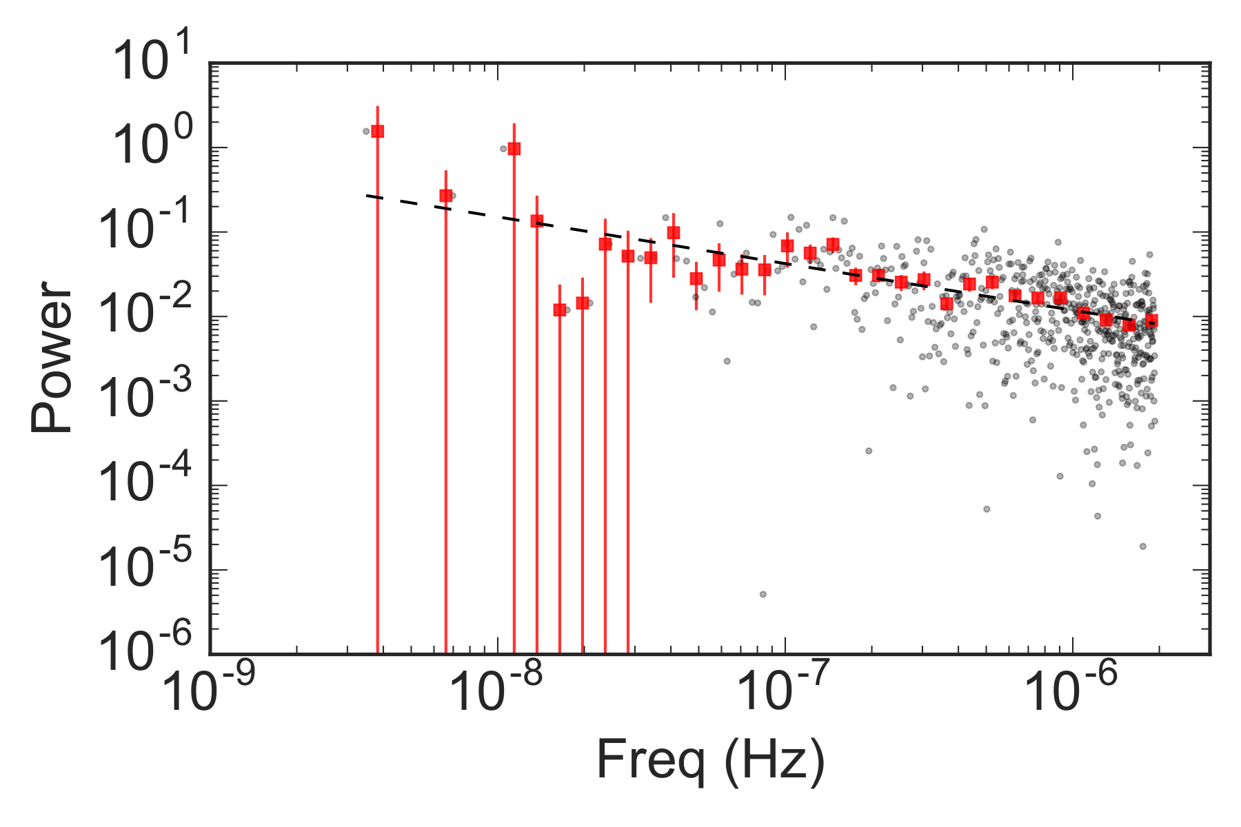
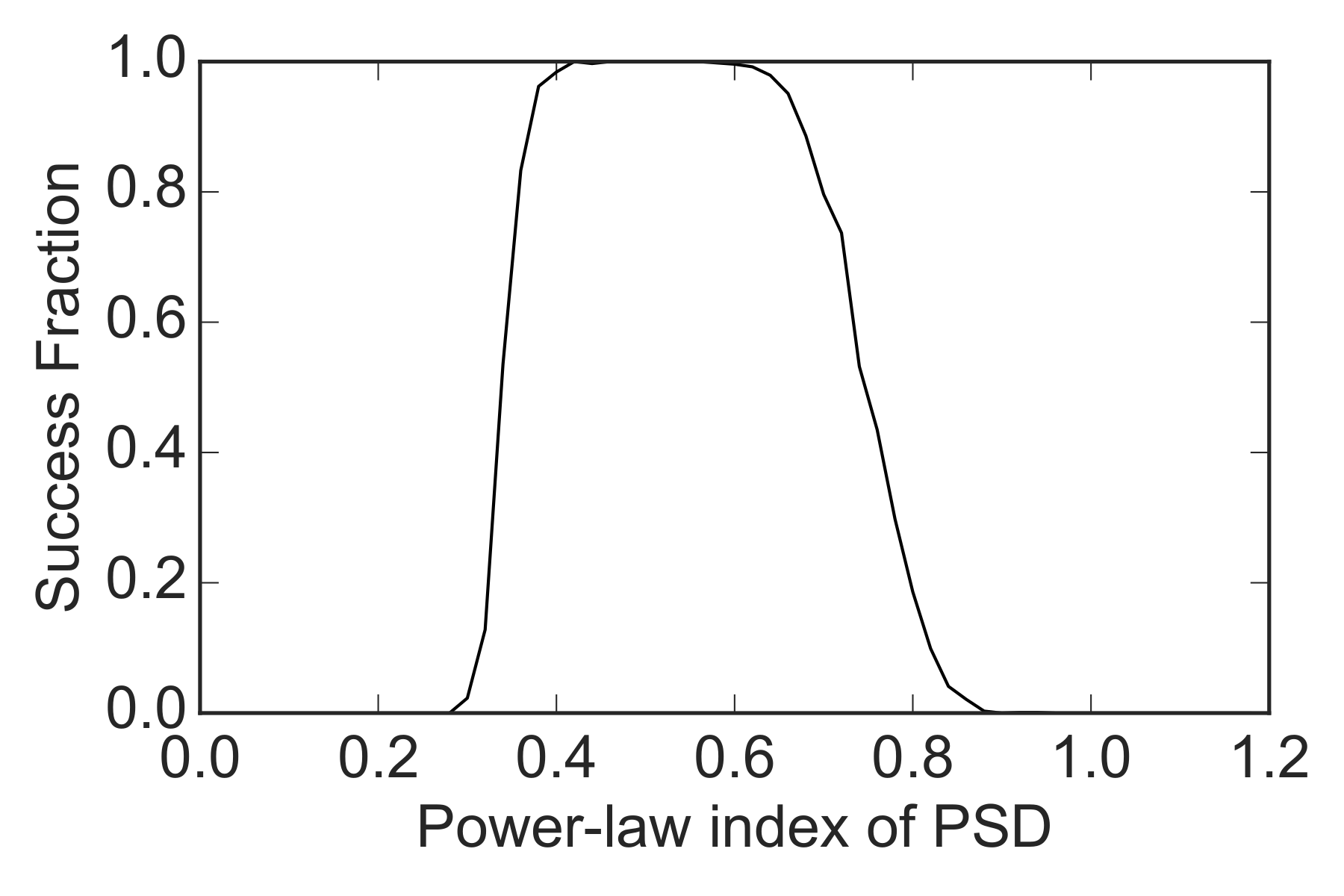
Figure 10: Left: The power spectral density distribution of the 3-day-binned Fermi-LAT light curve. The gray points are the periodogram from data (for details, see Timmer & Koenig 1995). The red squares are the rebinned periodogram. The dashed line shows a simple power-law fi t to the rebinned periodogram. Right: The "Success Fraction" of simulated light curves at diff erent power-law index of the power spectral density distribution.
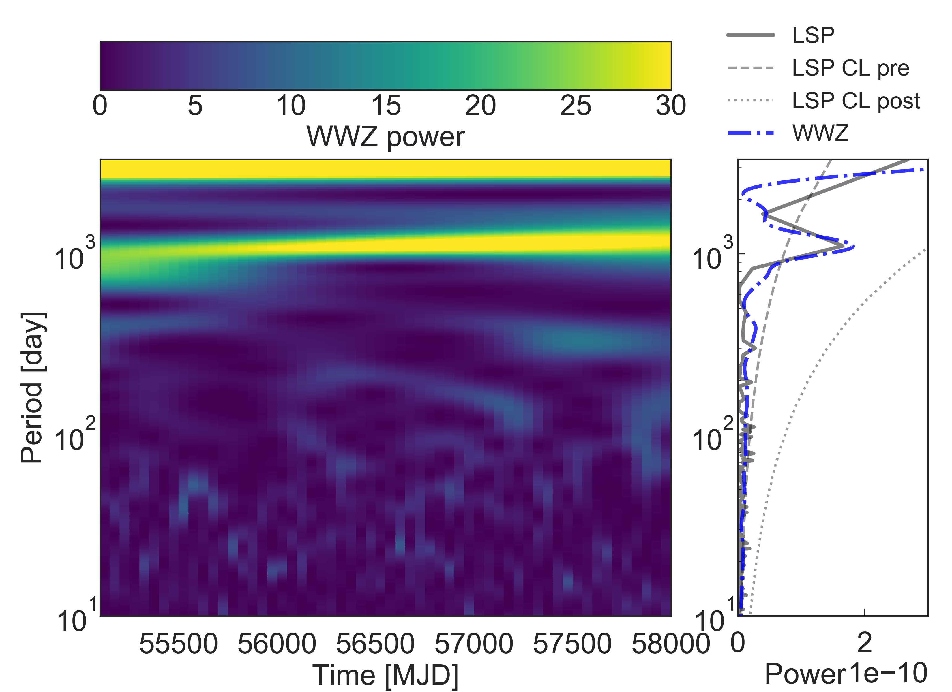
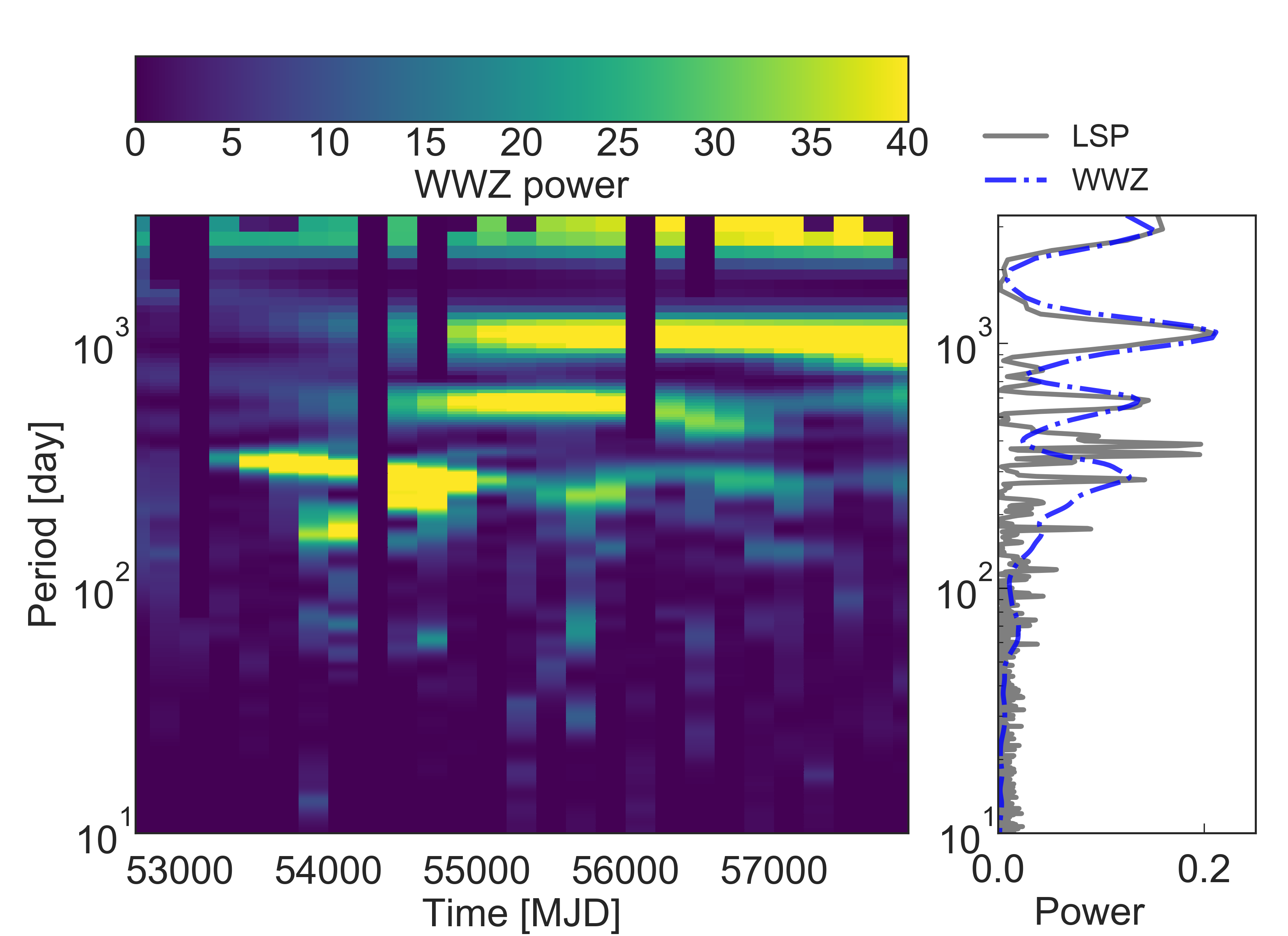
Figure 11: The scalograms from WWZ transform of the Fermi-LAT (left) and Tuorla (right) light curves. The Lomb-Scargle periodogram (solid gray line) and the marginal WWZ periodogram (dashdot blue line) are shown in the right panel of each plot. 90% con fidence limits from a purely stochastic model with power-law PSD generated using the method of Emmanoulopoulos et al. (2013) are also shown, including (dotted gray line) and excluding (dashed gray line) the eff ect of the 553 trial frequencies.
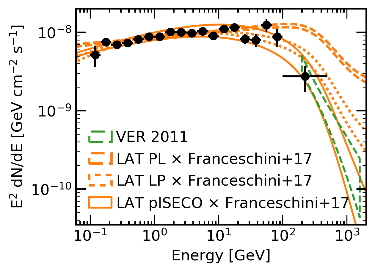
Figure 12: SED of the entire Fermi-LAT data set (2008-08-04 - 2017-09-05). The data were analyzed with three di erent spectral models as described in the text: power-law (dashed), log-parabola (dotted) and power-law sub-exponential cut o ff (solid line). To visualize the connection with the VHE data, the VERITAS butterfly for the data from 2011 (Aliu et al. 2013) was added. The LAT butterflies have been extrapolated to VHE energies and the eff ects of the EBL included (Franceschini & Rodighiero 2017). See details of the Fermi-LAT data in Table 14 in Appendix C.
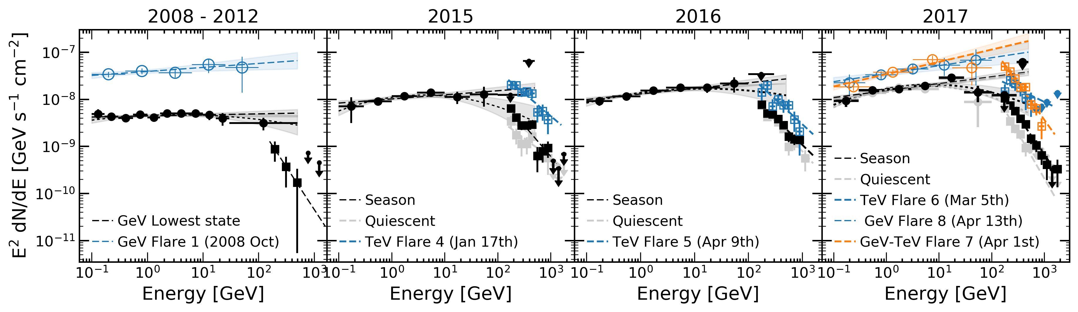
Figure 13: SEDs for the LAT and VERITAS data, including flares that have not previously been analyzed. Round points correspond to the Fermi-LAT data, while the squares correspond to VERITAS. Data and butterflies for the flaring states are shown in blue and orange. Data in the quiescent state are shown in gray. From 2015 to 2017, the black data points correspond to the total data sets for each season. Power-law and log-parabola butterflies are shown for the black spectra. Only power-law butterflies are shown for the flaring states. Non-coincident GeV-TeV flare SEDs are shown in blue, while the orange SED represents Flare 7.
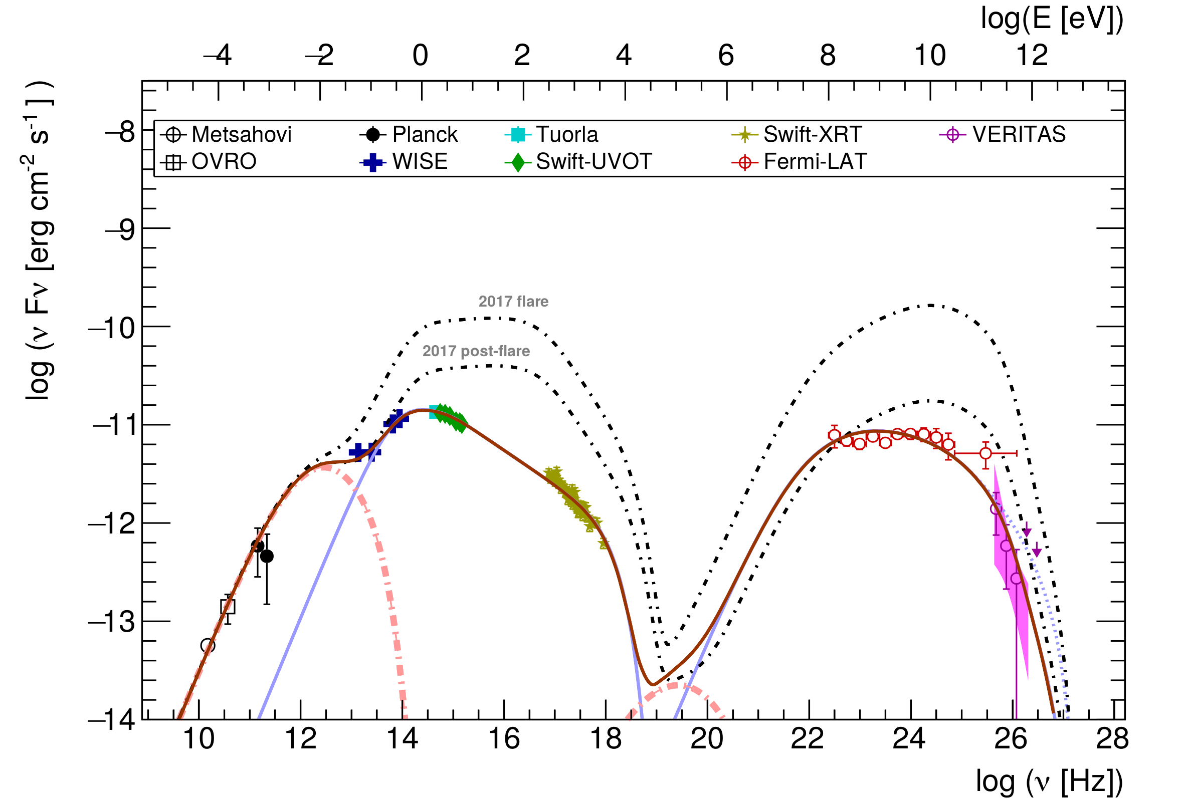
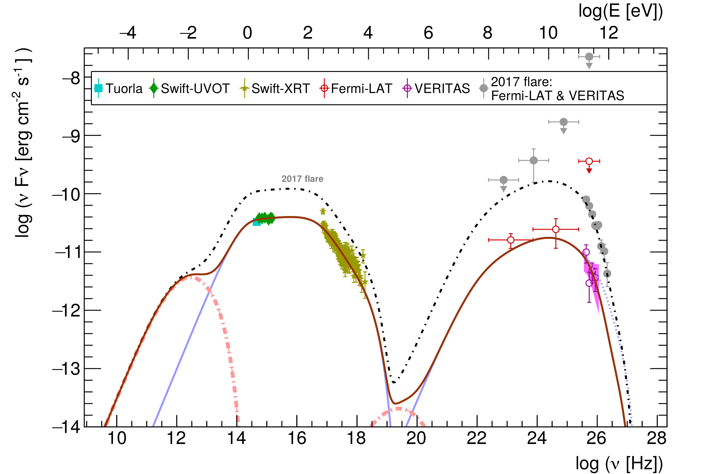
Figure 14: Multiwavelength SEDs and models of the source low state (Left ), 2017 flare and 2017 post-flare (Right). Plain blue lines are the blob synchrotron and SSC contributions, dot-dashed pink lines are the jet synchrotron and SSC emission, the blue dotted line is the intrinsic SSC emission without EBL absorption, and the thick brown and thick black dot-dashed lines are the sums of all components.
Figure 15: Photon index versus the logarithm of the frequency of the synchrotron peak. Color markers represent classi fications, indicated in the legend, for GeV-detected blazars as published in the 4LAC. 1ES 1215+303 shows a spectral shape characteristic of IBLs during the low state, while exhibiting HBL-like properties during the high state in April 2017. This extreme shift is observed with both the results of the blob-in-jet modeling and the cubic polynomial fi t (see text for details).